Creative Ways to Spice Up Your Instagram: The Ultimate Photodump Idea
Are you tired of posting the same ten-slide carousel on your Instagram?
Are you looking for a way to showcase more than ten photos in a single post?
Look no further! Discover how creating a seamless carousel in a charming scrapbook style can inject personality and flair into your Instagram photodumps and yearly recaps.
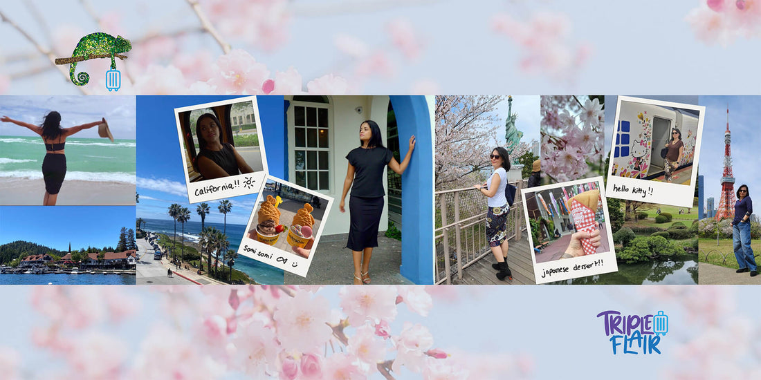
Here is the post we created for the @TripleFlair IG to showcase how our clothing can be worn throughout your travels
1. Step-by-Step Tutorial with Photos and Videos
Discover how easy it is to create a scrapbook style carousel with our comprehensive tutorial. We include step-by-step instructions, accompanied by photos and videos, to ensure you can follow along effortlessly.
Part 1:

Open Canva, and on the home page select the custom size canvas size. Make the width 1080 px.
![]()
Now, decide how many slides you want your carousel to be. I chose 4 slides, and got my the canvas size using the following equation:
1080 x 4 = 4320.

Keep in mind canva only supports carousels the size of four slides, so if you want to add more slides you will have to make two separate carousels. So for example, if I want 8 slides, I will add a page to my canva document, so I have two separate pages each the size of a 4320 px canvas.
Once you have your canvas, go to file, select settings and then click “add guides”.

Click custom and put the same number of columns as the amount of slides you want in your carousel. Here I selected 4 for my example. Then make the gap zero pixels, so you don’t have a weird space in between which would ruin the seamless effect.

Now you have your canvas to start designing! The guidelines will show you where the slides will be split by instagram, so make sure to add your photos with that in mind.

I start from left to right, filling in photos of scenery with photos of our model wearing TripleFlair clothing. I made sure to make one of the photos overlap past the guideline onto the next slide. This is what will give it that seamless scroll effect on instagram
.
I love adding polaroid frames to give the post more personality, and to make the seams between the slides more seamless. Here I added a photo on public transport and one close up of the Valencia Skirt. I also began to add more to the third slide, where I started adding photos from Japan.

The key to making it aesthetically pleasing is to strategically place the images so they are not cut in an awkward place, let’s say the middle of a face or splitting the body evenly in two. In the second slide


Part 2:

Download the app unsquard to cut up the photo into the desired amount of slides. Then, select the photos you want unsqrd to have access to or give access to all photos.
At the bottom where it says pieces, select the number of slides you want in your carrousel. We selected 4 pieces because we want 4 slides.
The result will be four separate photos you can post in order to achieve a seamless look.
 .
. 
 .
. 
Now, you are ready to upload to instagram! Open up instagram, click create a post, and make sure you upload the photos in the correct order. Add a caption that describes your trip, keep it short and sweet with a phrase or emojis or leave it blank to add an air of mystique.
Congratulations! You’ve created a creative seamless carousel which will be the perfect way to spice up your grid!
If you want to add more than four slides, repeat this same process with your desired amount of slides. One slide will not be seamless, but it will be undetectable to the untrained eye.
2. Curate Your Photos for a Playful and Sophisticated Look
Learn how to curate your photos like a pro! We'll share tips and tricks to help you achieve that perfect blend of playfulness and sophistication in your scrapbook style carousel.
A good photo dump ideally includes a mixture of:
- Portraits
- Selfies
- Candids
- Landscapes
- Food and drink
- Other special tidbits like ride tickets or airplane boarding passes.
We will use the TripleFlair photo dump as an example to show you how you can mix and match these elements to create a balanced and dynamic post. We included Portraits, Candids, Landscapes, and Food photos.


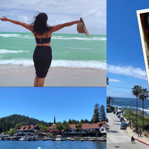
On the left, we chose a portrait of our model at the beach and two landscape photos. In the polaroids, we chose a candid of our model on public transportation and a food photo (somi somi ice cream). Next is another portrait of our model in an arched doorway, and then a portrait of our CEO in Japan. We included a close up of the cherry blossoms and on top a polaroid with a japanese dessert. The next polaroid is a portrait next to a hello kitty metro wagon (how cute)! Lastly, the backdrop is beautiful greenery and a final portrait of our CEO in front of Tokyo Tower.
As you can see, for each location we added one food photo to keep the post balanced and cohesive. We also made sure to match the colors of portraits with the colors of the landscapes to give it a harmonious look. Use the polaroids to strategically cover up areas where the colors might not match as much or to transition. For example, the photo of the japanese dessert serves this purpose.
In this post we included three TripleFlair products, our 9-in-1 Victoria Top, our 8-in-1 Valencia Skirt and our 4-in-1 New York Top.
Stay stylish, wander often, and let your creativity lead the way on your next adventure!
The TripleFlair Team 💜💜💜
